TRAVEL | The Henry Hotel Manila: Like no other in the Metro
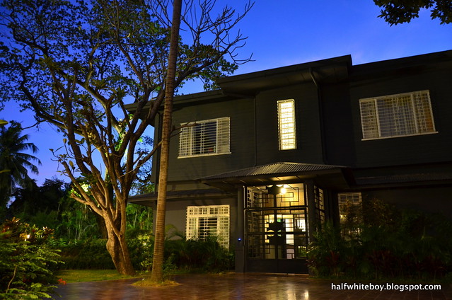
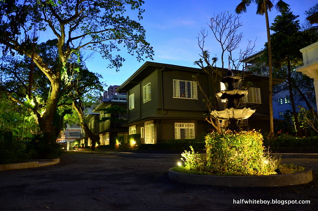
One of the gray houses at dusk. Beautiful, don't you think?
As fans of The Henry in Cebu, Kwittiegirl and I were excited to learn they've opened another hotel in Metro Manila last December. We've been meaning to try it out but somehow those plans never materialized. Finally over the weekend we were able to enjoy a two-night staycation at The Henry Hotel Manila.
Here's my review.
Architecture and ambiance
The hotel's Manila iteration is extremely different from the Cebu original's industrial, post-modern design. While there are familiar touches, like for instance its preference for black exteriors with white accents (although this one's in dark gray), The Henry Hotel Manila is laid out differently.
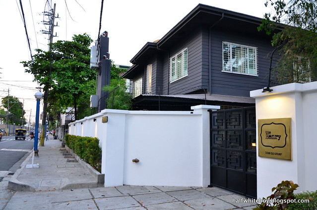
First off this hotel is not a single building but a strip of refurbished houses from the 1950s set in a rectangular compound with lots of old trees that are part of the original landscape design by National Artist for Landscape Architecture Ildefonso Santos. Although it carries the Manila tag, the hotel is actually located in the heart of chaotic Pasay City. It's a totally different world inside the hotel's gates, however, an oasis concealed from all the horrid urban chaos.
Outside, the hotel already offers hints of beauty behind its walls.
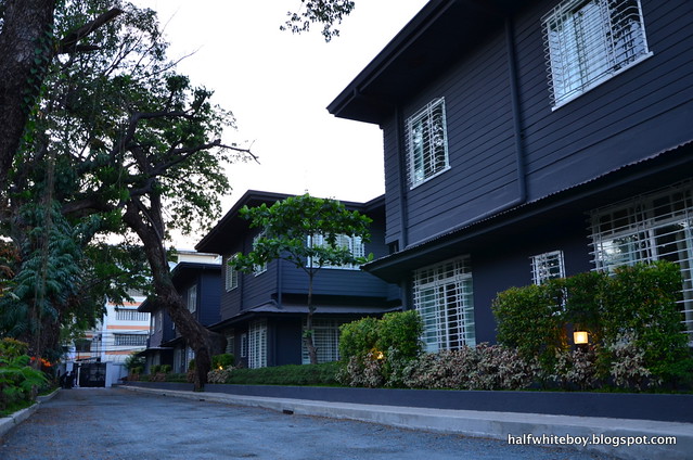
The gate opens up to a driveway lined with old houses on one side.
Save for the centerpiece concrete house, all houses in the compound -- of which there are quite a number -- were designed in the same likeness. The hotel only occupies five of them, including the centerpiece structure they've aptly called "The White House" because of its all-white exterior. The rest either remain as residential abodes or have been converted to an art gallery, an atelier, and furniture showrooms.
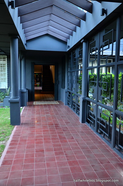
So how do you convert a strip of houses into a hotel? Hanky Lee, who owns the original The Henry in Cebu and who has secured the lease of five houses in this compound, has tapped architect Justin Basco who simply built covered walkways that connected the four gray houses into one cohesive structure. It may be simple but it's a clever idea. The result felt like it's just one really long corridor, punctuated by spaces fronted by pocket gardens. He intentionally left the White House out, which I perfectly understand. I mean, it just had to stand alone and apart from everything else.
The houses may have undergone a massive paint job and accompanying retrofitting efforts but the integrity of their original design is still very much intact, thanks to Basco's handiwork and of interior and furniture designer Eric Paras. Some of these changes include covering entire windows with clear glass, but since they've retained the sliding wood-framed windows and metal grills, that old world feel is never lost. Besides, those glorious baldosa tiles are still all-original from the 50s.
For the hotel furniture Paras employed both wood and metal, an aesthetic both Kwittiegirl and I personally like. The resulting look from this blend is luxe and elegant, complemented perfectly by a variety of equally handsome lamps and lighting fixtures.
The first of four interconnected gray houses, complemented by beautiful landscaping.
One of the walkways built to link the four houses as one cohesive structure.
The Henry Manila's very own White House.
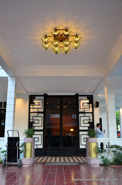
Never mind the trolley on the left but I think you'll agree that this is one beautiful building. Awesome lighting fixture, too!
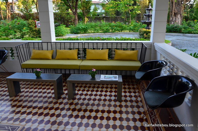
The lounge area next to the front desk. My, I really like those black chairs. Kwittiegirl says they remind her of an Eames design.
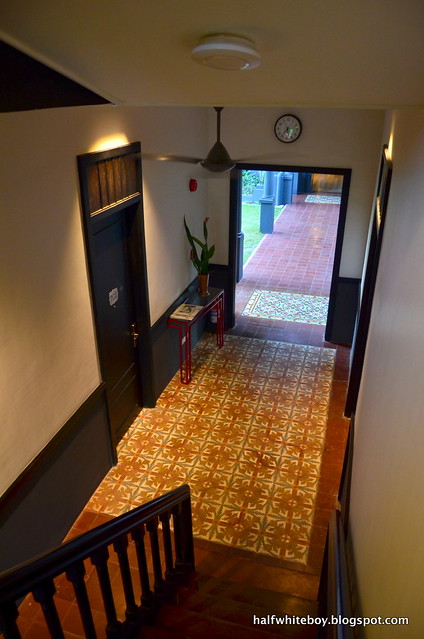
The hallway on the ground floor. Our room was upstairs.
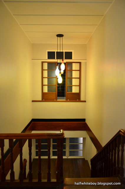
Simple touches that don't take away from the house's original design.
In terms of design alone, I'm a fan. It's obvious, since I enjoyed a little personal photo shoot at The Henry Manila feeling like a don.
Reservation and checkin
Hotel booking sites like Agoda and Booking.com have room allocations from The Henry but we decided on booking directly through the hotel website anyway. It was fast and easy.
The small and ambient-lit reception. Notice the sampaguita glass panels beneath the window. The staff also wear the same uniform as their Cebu counterparts, complete with black-rimmed glasses.
The hotel is in a gated compound, so a security guard screens every vehicle entering the gate. At least we know we're safe here.
Immediately after parking, a hotel staff was already there by our car to assist us with our bags. The front desk staff were all smiles and efficient, and we were led to our room in no time.
Our room
Compared to the Cebu original, accommodation options at The Henry Manila cost more (available rates vary). Here they have 29 Classic rooms, 4 Suite rooms, and 1 two-bedroom Owner's Suite. There were no Suite rooms available for our selected dates, so we ended up with a Classic.
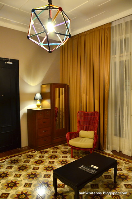
The room was quite spacious although it's a far cry from the really big rooms at The Henry Cebu. It has its own charms, of course, rooted mainly on nostalgia. There are two huge windows; the sliding, window pane type with sheets of either glass or capiz shells that we see in a number of old houses in the province.
For whatever reason, however, they've covered the entire window space with a sheet of clear glass. So if you were hoping for some emo, padungaw-dungaw sa bintana (looking out of the window) moments while seated on the railings, sorry but that ain't possible. Nonetheless, the windows allow lots of light in that, coupled with the high ceiling, afford the room a bright and airy atmosphere.
The walls are painted in a light beige color while all the furniture, from the old aparador (wooden closet) to the tables and wall fixtures, are in a much darker hue. It may be too much to ask but it would have been lovelier to see the walls covered in wallpaper, or that there was an accent wall at the very least.
The floor was made of hardwood, as our room was on the house's upper level. Downstairs it's concrete and baldosa tiles.
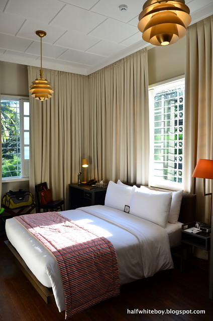
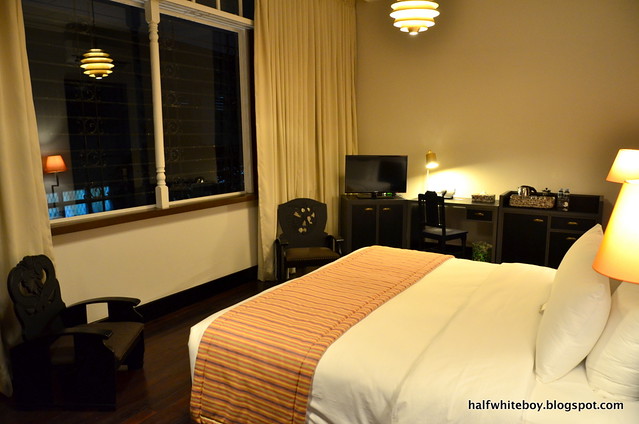
Our bright and airy Classic room, with a pair of gorgeous artichoke lamps that hang from the ceiling.
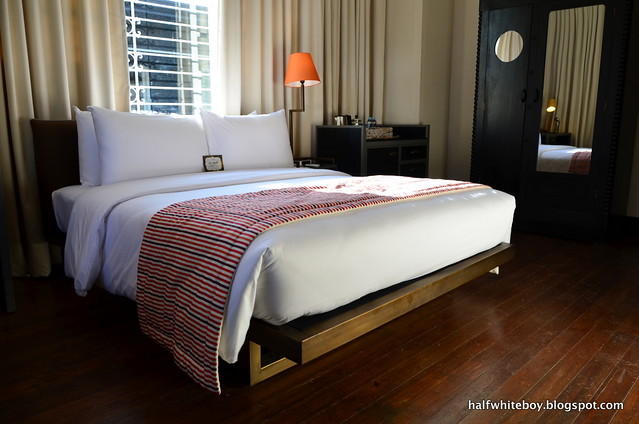
Hardwood floor, sturdy bed frame, classic old cabinet -- ah, nice!
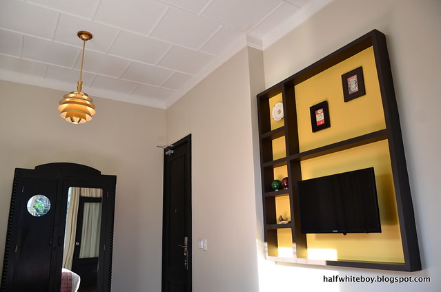
A view of the room from a different corner.
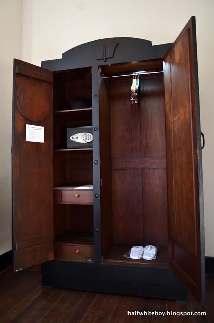
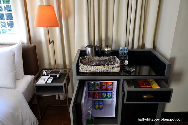
Our room was fitted with a queen-size bed (others with two single beds) and was furnished with an old wooden wardrobe cabinet, a writing desk and chair, a bedside table, personal fridge, minibar, coffee and tea-making facility, flatscreen TV, hair dryer, and an electronic safe (that I wish could at least fit a laptop). Save for the wardrobe, which are original old pieces sourced from various locations and are therefore unique to every room, it's pretty much the same setup across all Classic rooms. The Henry Cebu, on the other hand, prides in the fact that no two rooms are the same.
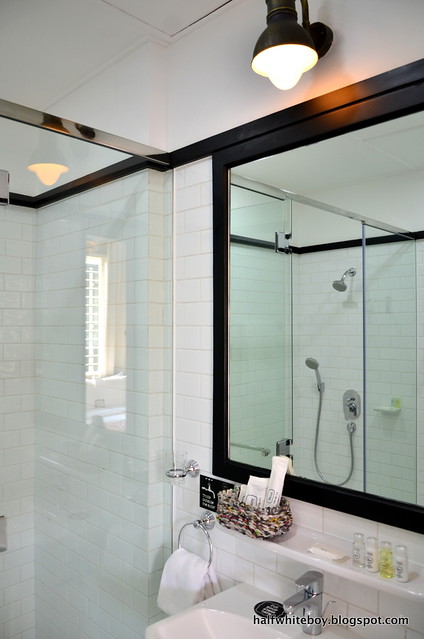
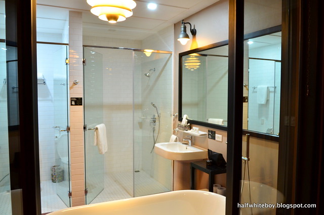
The bathroom is spacious enough and is covered entirely in white tiles. The shower room comes with a handheld and a rainshower head option. I noticed, though, that it takes a while for the tap to release hot water. I also wish they provided other options for toiletries because I found the lotion too floral and feminine.
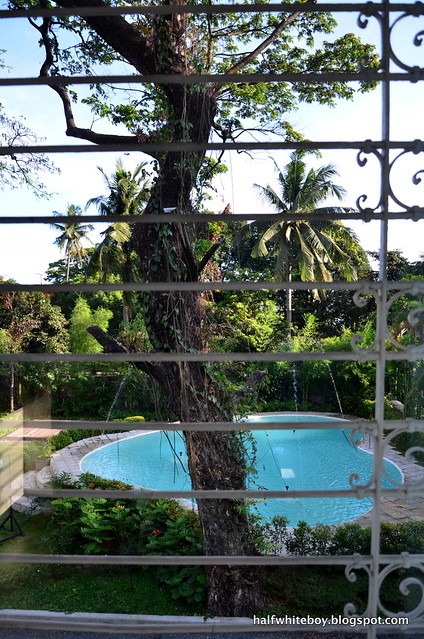
The view from one of the windows. It's covered in glass, though, so no muni-muni, padungaw-dungaw sa bintana (contemplative, looking out of the window) moments here.
A slice of the all-white bathroom.
Inside the wardrobe, updated with an electronic safe and LED light. Still waiting for the lion and the witch.
The writing desk. I love the touch of blue on that chair.
The minibar, where coffee-making involves a coffee press.
It may be the cheapest but the Classic is already a good room. My only beef is how noise created by some rude and inconsiderate guests is easily heard through the door. There's probably little the hotel can do about acoustics because they're just repurposed old residential houses but perhaps they can zone guests, like maybe put those with children in adjacent rooms under one house. Ditto with single occupants and couples who probably want some peace and quiet. I think everybody will benefit from this setup.
The other rooms
Hotel staff Patricia and Stephanie were kind enough to show me the Suite and Owner's Suite so I could take photos. So here goes.
Suite
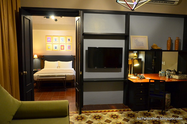
It's a one-bedroom suite with a receiving room fitted with a daybed, coffee table, writing desk, some chairs, minibar, tea and coffee-making facility, flatscreen TV, and an old cabinet. The anteroom also opens up to its own pocket garden.
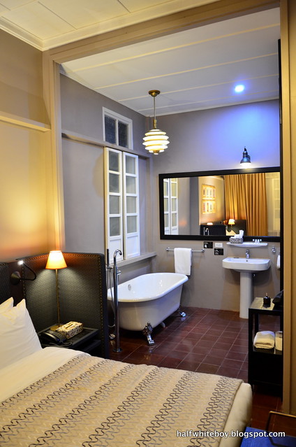
The bedroom, on the other hand, has a queen-size bed, TV, and cabinet. The bathroom and shower room follow the same all-white scheme but the sink and bathtub are in an open space within the bedroom.
A peek into the bedroom as seen from the anteroom. The old tiles are just beautiful, don't you think?
Some handsome furniture in the anteroom. The glass door on the right opens up to the garden.
The bedroom and bathroom are just one continuous space. To the sink's right are the toilet and shower.
Owner's Suite
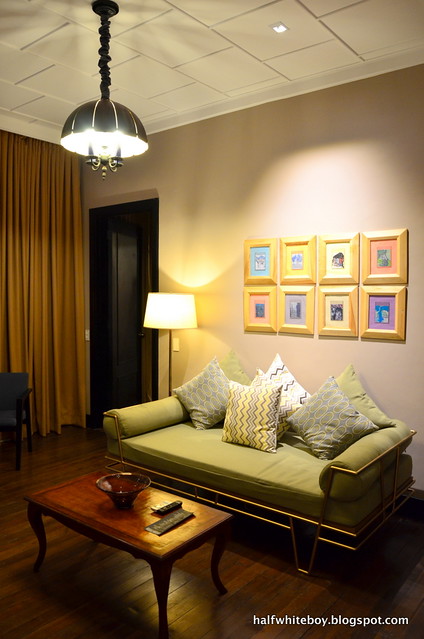
This is a two-bedroom suite that has an anteroom and a spacious veranda. The receiving area is furnished with a couch, coffee table, a small round table, some chairs, a console, and a TV. It's tastefully decorated for sure. I also have to say that the lighting fixtures here are so nice.
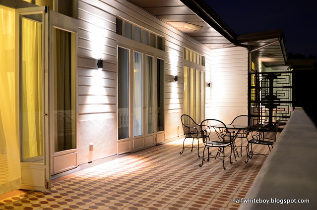
The master's bedroom carries that same classic elegance found in practically all rooms of this hotel. It may be a bit small for a master's retreat but I admire the baldosa-tiled flooring, huge windows, and hardwood furniture. There's a door that opens up to a very spacious rectangular balcony, perfect for don and doña moments (Haha!). It's just a bit weird where they placed the TV, which is on top of a desk by the bedside.
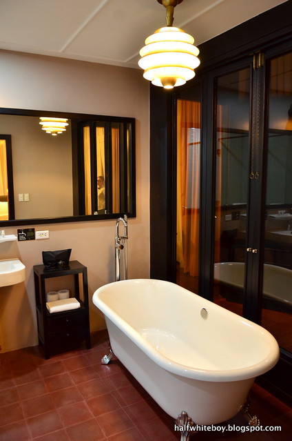
Unlike the regular suite's layout, the bathroom here -- bathtub included -- is in an enclosed space. However, there's a glass-paneled door right next to the tub that, if you're feeling it, opens up to the hallway leading to the master's bedroom. Toilet and shower are in separate cubicles but as with every other room there's only one sink. It would have been better if this room at least had a his and hers sink.
The anteroom at the Owner's Suite.
This is still the anteroom, viewed from a different angle.
The master's bedroom. Weird TV placement, though.
A section of the bathroom.
The bathroom as viewed from the hallway, with that door by the bathtub ajar.
The Owner's Suite's second bedroom.
The balcony, for those moments when you need to come out of your bedroom, look down on everyone else, and maybe sing "Don't Cry for Me, Argentina."
Ironically the other bedroom feels a bit bigger than the master's, though I don't know the exact dimensions. This one has a wooden floor, a queen-size bed, writing desk and chairs, and its own minibar and coffee-making implements. It looks and feels less opulent than the master's, which of course should be the case. It has its own bathroom too but sans the bathtub.
It's a nice suite, but is probably best for families.
Dining
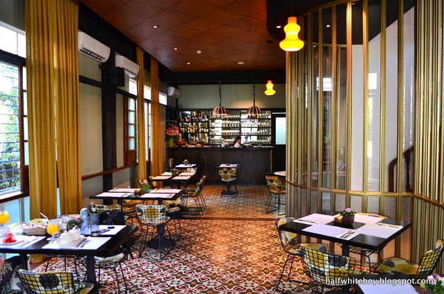
The hotel has partnered with Apartment 1B to take care of its food department. The restaurant is located in the White House and sits right next to the front desk. It has a warm and elegant feel consistent with the hotel's design aesthetic. I love the result produced by their use of metal and glass. Apart from letting more light in, the sampaguita glass panels under the windows are simply beautiful. Kwittiegirl loves the cushioned metal chairs, which remind her of a Harry Bertoia, she says.
The restaurant's ambiance is complemented well by the nice and relaxing French music they're playing. Soothing and easy on the ear as the singer's voice may be, you'll soon realize it's Carla Bruni's CD on perpetual repeat. Yes, Bruni, the former first lady of France. And I kid you not about perpetual repeat because it was the same songs playing over and over throughout our 3 days at The Henry.
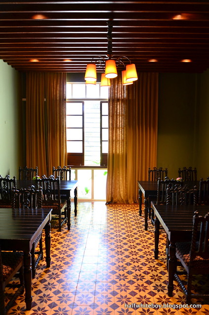
Anyway, aside from the main dining area, there's another enclosed space that I guess can be used for small functions. Here the tables and chairs are different, which are all made of hardwood complete with carved detailing. It also has a gorgeous ceiling of wooden planks.
The restaurant's main dining area.
The other dining area.
A sampling of Apartment 1B's food.
Our accommodation already came with breakfast, which had staples of bread and butter, salad greens, fresh fruit slices, and coffee, tea, or juice. In addition, you get to choose from oatmeal, pancakes, french toast, sautéed or curry vegetables, veggie omelette, or egg breakfast. The last one comes with either rice or fries and your choice of either corned beef hash, sausage patties, smoked bacon, sardines in olive oil, longganisa (native Filipino sausage), beef tapa (marinated beef), bangus (marinated milkfish), or chicken adobo flakes.
On other occasions we've had chicken noodle soup (Php 160), corn chowder (Php 190), house salad (Php 280), and their Apt. 1B Big Breakfast (Php 590, which ironically we had late one afternoon). Soup was good and the salad greens were fresh. The Big Breakfast was a winner with two eggs, bacon, English bangers, Canadian ham, fries, and toast. But then I'm partial to breakfast food.
We also tried their salted caramel chocolate torte (Php 220), a delectable treat that's not too sweet. Haven't tried their other offerings but I bet they're just as good for the simple reason that it's Apartment 1B.
With regard to service, food doesn't take long to get to your table and the waitstaff are mostly attentive to your needs and calls.
Facilities
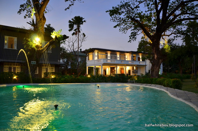
The Henry Hotel Manila is clearly a place for some peace and quiet, early morning or late afternoon walks, and maybe even romance. As such, the hotel doesn't promise a lot in terms of amenities. Save for the restaurant, they only have a small pool, which I wish came with some sun beds because you got nowhere to sit or sunbathe. It's more of a dipping pool than a lap pool, though, as there are fountains all over.
Although no longer part of the hotel, the compound also houses the Avellana Art Gallery, Eric Paras's furniture showroom called Artelano11 (spread across three houses), and Joji Lloren's atelier, so in a way they feel like extensions of the hotel as added attractions.
The hotel pool. Can't do laps here, though.
The parking area.
The Henry Hotel Manila is perfect for leisurely strolls.
As for parking, there's ample space for guests's cars.
Service
The hotel staff are nice, efficient, and very accommodating in general. Housekeeping does a good job, too, except for that one time they missed the "Please make up room" sign on our door. Laundry and pressing services are likewise available subject to cutoff times. But if you want your clothes back fast, an express option is also offered.
Checking out
Perhaps the staff were overwhelmed with processing back-to-back checkouts and having to unnecessarily deal with curious non-hotel guests and onlookers who wanted a tour or an ocular, so no one came after I requested for help with our bags. The confusion was apparent when they called up our room to ask what time we were checking out.
Anyway, after everything was ironed out, checkout processing didn't take long.
*************************
In hindsight
There's a lot to be admired about The Henry Hotel Manila, topped of course by the incredible job they've done at refurbishing those old houses while retaining the design essence of the original. They've created something that speaks of classic elegance and even when it's from something old, the result is something refreshing and different from what most hotels have to offer.
The stately White House at dusk.
The food and service are great for the most part but management has to be careful in upholding overall guest experience. Oculars may be okay but they probably need to be a little more snooty so as not to take away from their staff's time that's best used in attending to the hotel's actual guests. Have tours and oculars scheduled instead of entertaining everyone who just show up out of nowhere. It may sound too much but I also suggest zoning occupants because being old structures, not much can be done about soundproofing their rooms. Assign separate houses for families with kids and couples and solo guests.
Just the same, this hotel is worth trying out.
*************************
The Henry Hotel Manila is located at 2680 Compound, F.B. Harrison Street in Pasay City. If you're coming from Buendia, it's on the left side; you'll go past the Pasay City Hall and it's near the Daughters of St. Paul and right across Gideon Academy. If you're coming from EDSA, it's on the right side and way before the city hall.
thehenryhotel.com/manila
Meanwhile, they have a few stray cats on ground:










what a great find....i almost stayed in the henry hotel in cebu a few years ago but changed mind the last minute. since there is now one in manila (or pasay to be exact), i might try it for one night..
ReplyDeleteLooks like Henry Hotel is a one heck of a hotel to stay in. It will not only make you have a look back at our country's rich history(Spanish Era) but also I think a memorable and comfortable stay indeed. Like Henry's, I also suggest that you to try a modern Quezon City Hotel in Summit Hotels Magnolia.
ReplyDeleteWhat made me quite happy was the fact that there are decent sidewalks in that part of Pasay he he
ReplyDeleteGreat information! For everyone who need to know price of Manila Airport Departures, please contact with GoAsiaDayTrip - the most trusted airport transfer and day tour company in Southeast Asia.
ReplyDeleteConsidered as one of the most premium hotels in Manila, Solaire Resort & Casino enjoys a prime location at the heart of Entertainment City, boasting panoramic views of the iconic Manila Bay premium hotels in manila
ReplyDeleteThat looks a nice place. Thanks for sharing! Anyway, you should also try to visit Glorietta. I'm sure you'll love it too.
ReplyDeletegjj3sg112
ReplyDeletegolden goose outlet
golden goose outlet
golden goose outlet
golden goose outlet
golden goose outlet
golden goose outlet
golden goose outlet
golden goose outlet
golden goose outlet
golden goose outlet