DESIGN | Artelano11: The Eric Paras furniture showroom
Just one of the many spaces at Artelano11 all spruced up.
Calling it a showroom, I think, trivializes what Artelano11 (or A-11) is. After all, it is not just a room but three full houses of Eric Paras-designed furniture and a host of other things. Yes, three full houses!
The houses date back to the 1950s and are part of the compound at 2680 F.B. Harrison Street in Pasay City where The Henry Hotel Manila is located. Paras, a renowned Filipino interior designer who's also working with furniture, was responsible for the interiors of the hotel.
We were happy to check out A-11 when we stayed at The Henry last March. We were also lucky to meet the designer himself, whom we saw again at the recent Manila FAME. Allow me to give you a little photo tour.
It's the same familiar flooring from The Henry here. This was what greeted us upon entering the first house. The second floor is reserved as office space.
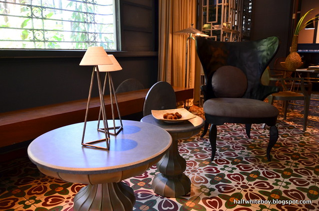
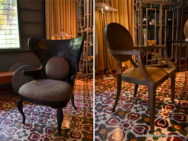
What a gorgeous pair of metal chairs. I really love the resulting effect of the hammered metal of the one on the left. I don't know what they did but both chairs felt normally warm and cozy despite the material used.
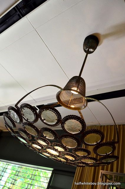
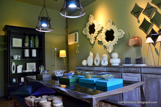
Aren't you loving this ceiling lamp or what?
Because of all the nice things around, you might not notice the dining table, whose all-metal frame sports an industrial look. And oh, those two white mirror frames on the wall, they're made of wood.
At the ground floor of the second building.
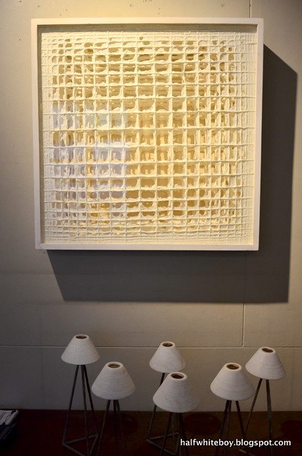
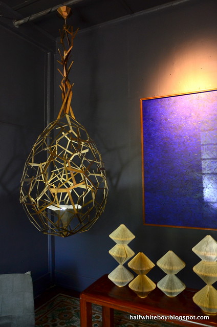
A beautiful framed piece from artist Wataru Sakuma, who works a lot with paper.
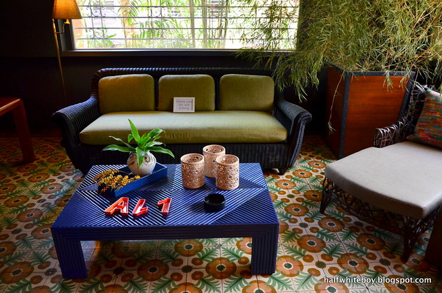
Blue appears to be a refreshing color on furniture, even if it's made of bamboo.
That abstract metal lighting fixture sure is one helluva statement piece. Probably too big for our home, though (as if I can afford it). Those little white things on the right, by the way, are made of sheets of paper. Very meticulous work, I must say.
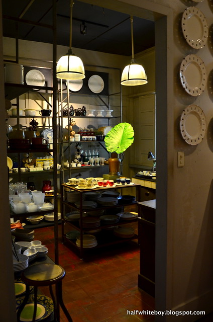
The Martha Stewarts can rejoice because A-11 also carries a variety of china and other kitchen stuff.
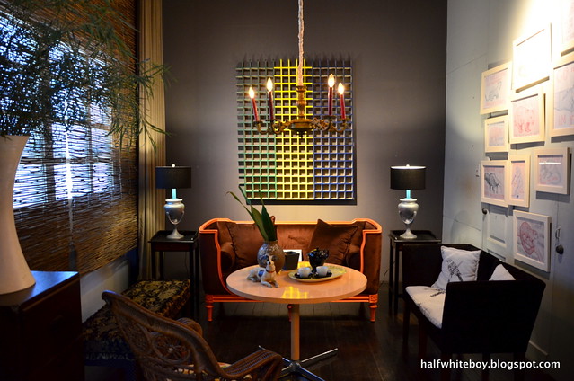
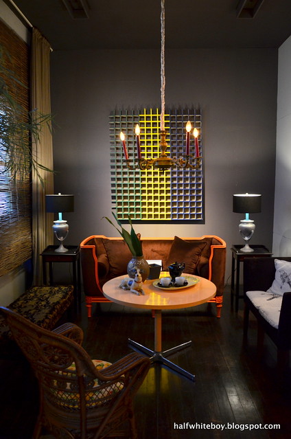
I like this space here on the second floor, basically because of the gray accent wall. Notice those two lamps on both ends; that minimal touch of aqua is a refreshing twist to all that gray.
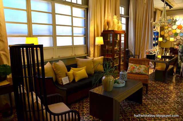
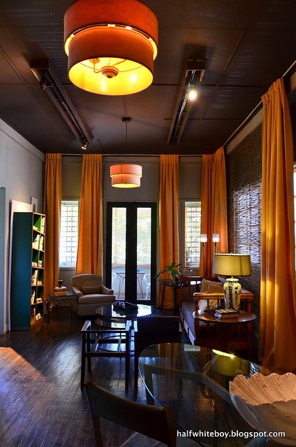
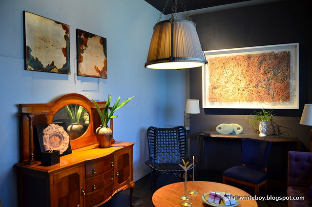
Very classy and warm. This is also at the second floor.
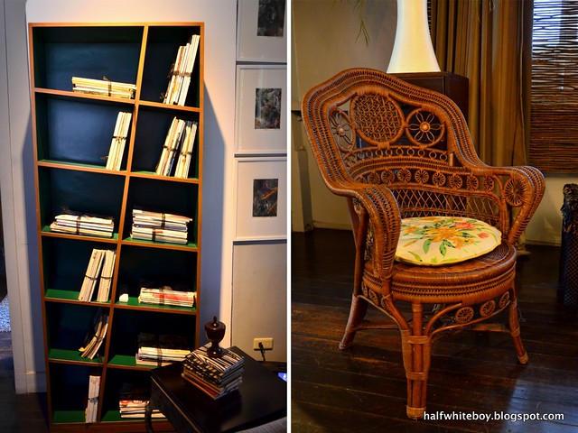
In focus: an offbeat kind of bookshelf and an intricately designed rattan chair.
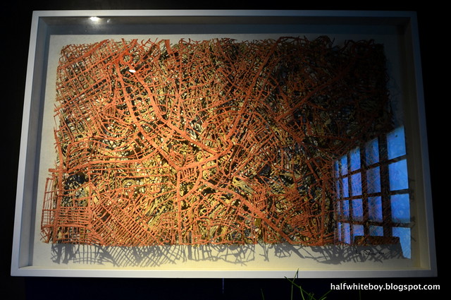
More nice things. Let's focus on that white frame on the right...
Another of Wataru Sakuma's pieces, this one is actually a map. When you look closer you'll see street names. Amazing work, huh! I also must admire his patience and tenacity.
I must say this showroom doesn't feel like a showroom at all. It looks and feels very... homey.
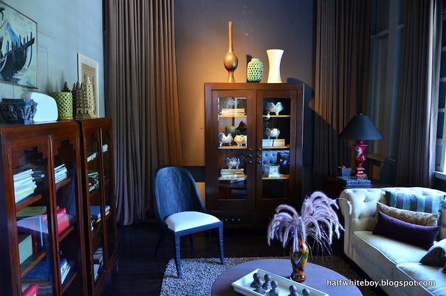
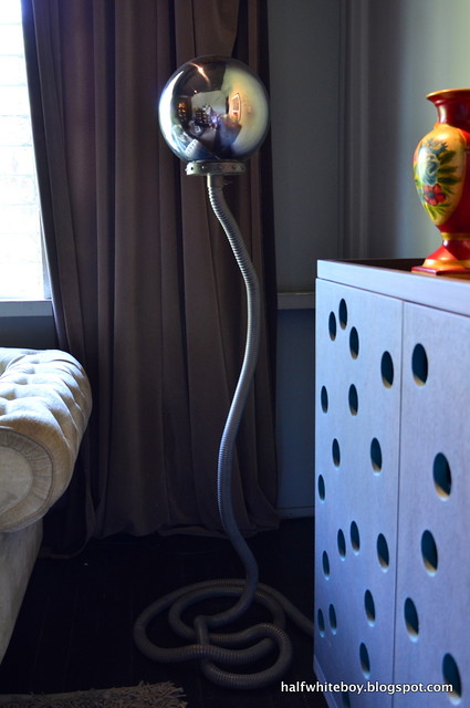
This would undoubtedly make for an interesting conversation piece at home. I wish it were a lamp, though. And lest we forget, that cabinet on the right looks nice, don't you think?
Unfortunately we weren't able to check out the third house anymore because there was a meeting at the time. So I guess we're left with a reason to go back some other time. And hopefully bring something home by then.
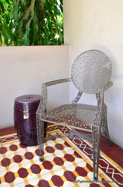
It sure looks like a Philippe Starck but it's metal.
For updates, check out A-11's Facebook page.
Amazing furniture...I completely fell in love with the blue bamboo table...I need something like that!
ReplyDeleteHugs
Andy
theblacklabelblog.blogspot.com
:)
Deletei do admire modern designs but i'm a sucker for classic designs....especially the rattan chair.
ReplyDeletedon't you just love how intricate it is?
DeleteNice to see you here and in my blog!
ReplyDeletehttp://afinaskaterblogspotcom.blogspot.ru/
Nice articles and your information valuable and good articles thank for the sharing information metal frame dining chairs
ReplyDelete